Most Recent News


Popular News


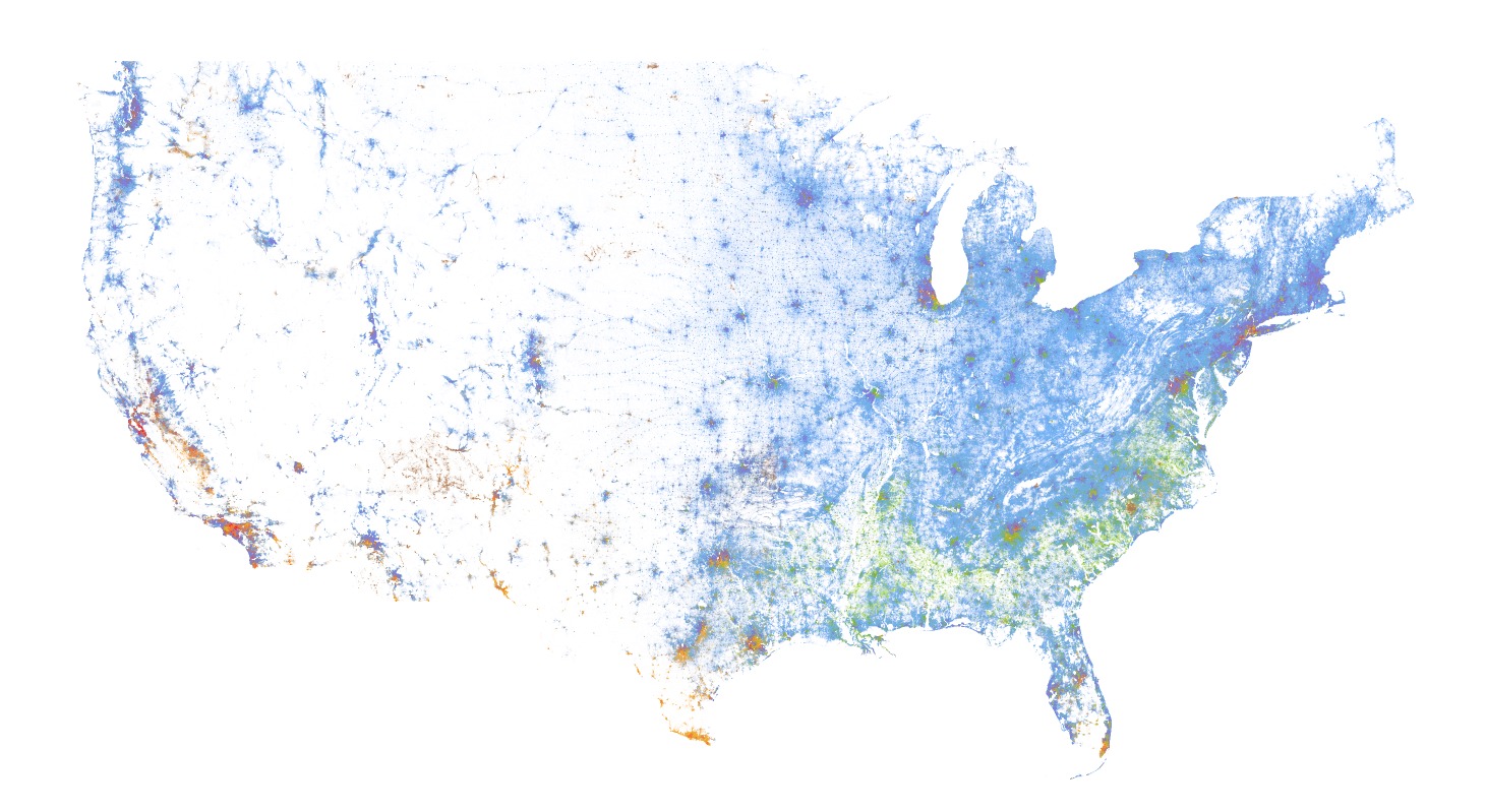
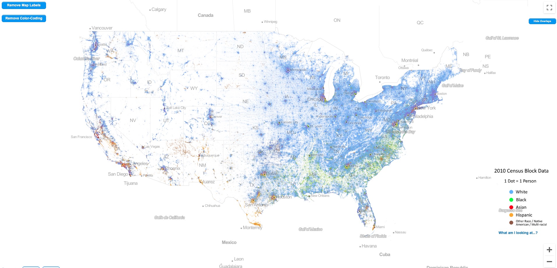
Sharing a great demographic research tool: The Racial Dot Map. Look at the nation in terms of race with one dot representing one person.

For today’s article, I simply wanted to share a fascinating tool that should have far more viewership: The Racial Dot Map.
The idea is simple. A map of the United States with one dot per person, based on demographic information.
As of right now, it is based off of the 2010 census data. But they are preparing to integrate and use the 2020 census data when it comes out.
This is a handy map and tells a lot about the country, and the states, without needing to say a single word.
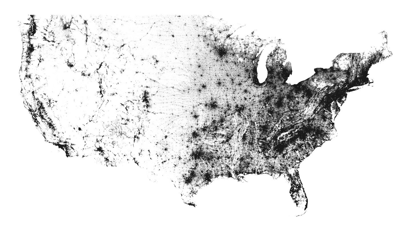
You can customize to remove the demographic info or to input state labels. It’s helpful to look at a general overview of the region in question and then move into the localities, to see the distribution change.
Anyway, it’s an excellent tool for seeing the demographic reality of the nation. Give it a look. Below are a few screenshot examples:
(To see full size -> right click, open image in new tab)


You can access the racial dot map here.
Read Next:
An Update On Our Demographic Destiny
Happy Independence Day To The American Nation
We Debate The Future While The Boot Is On Our Neck
If you enjoyed this article, bookmark the website and check back often for new content. New articles most weekdays.
You can also keep up with my writing by joining my monthly newsletter.
Help fight the censorship – Share this article!

(Learn More About The Dominion Newsletter Here)
Thanks Kaiser! I might add this to gtvflyers . com!
Glad to be of interest, HTA. Thanks for the comment.