Most Recent News


Popular News




Mapping diversity and homicide rates in the United States by county. I wonder if we'll notice any trends?

This picture is worth far more than a thousand words.
Two maps are provided below. One is a demographic map; the other is a homicide rate map. Both are broken down by county. Let’s review:
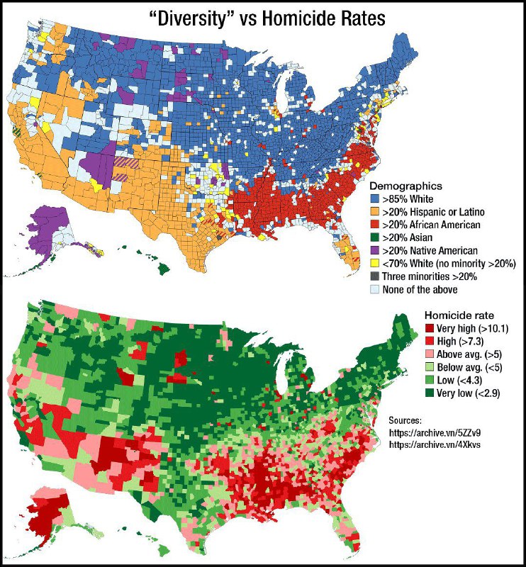
Wonder why the U.S. has such high violent crime rates? Well, it’s definitely not guns. Give this one a thorough review, and you’ll find the actual answer.
Imagine the crime rate if all counties were 85%+ white. It’s not hard to do, given the above maps.
Sources in the bottom right corner with links.
Enjoy.
Read Next:
The Grey Masses Are A Problem With No Solution
The Importance Of The Government System
Food Inflation Incoming: The Trap Is Set
If you enjoyed this article, bookmark the website and check back often for new content. New articles most weekdays.
You can also keep up with my writing by joining my monthly newsletter.
Help fight the censorship – Share this article!

(Learn More About The Dominion Newsletter Here)
What do you think is up with Texas? Why is it so much lower in crime than the other Hispanized states?
Great question. I’d need to dive into the county data to learn more. Initial thoughts are the rural effect (low population can skew the data), the massive amount of law enforcement, and of course the ability to shoot criminals in Texas. Also, Hispanics are less prone to crime than Africans. So it makes sense when comparing the southwest to the Southeast, at least.