Most Recent News


Popular News


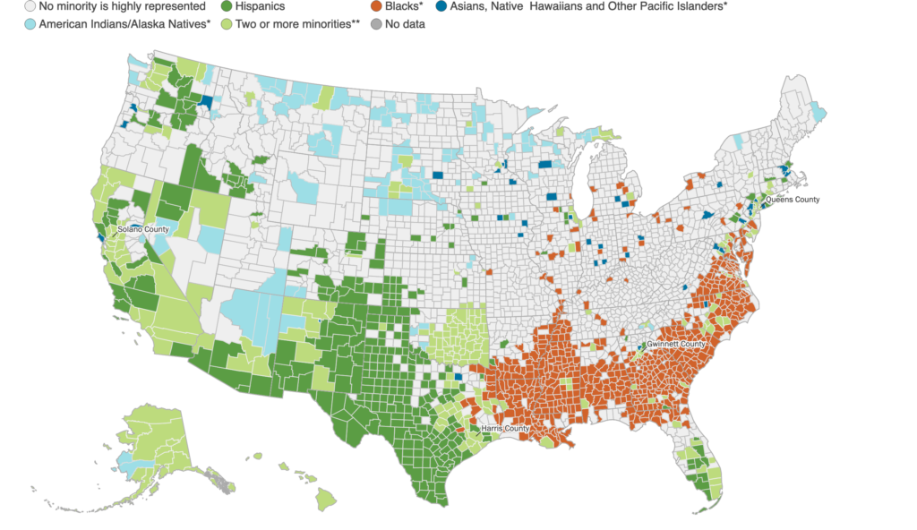
One of the most important maps available about the United States. A Map of Demographics By County using the 2010 Census data.
Leaving this here without much comment on it to use as a reference point for future articles. Infer whatever you want with it.
But don’t disregard it. This may just be the most important map of the United States available.
Here’s the technical details (From Brookings Institute):
Source: William H. Frey analysis of US Census population estimates, 2018
A group is highly represented if its share of the area population is larger than its share of the national population for Hispanics (18.3%), blacks (12.5%), and Asians, Native Hawaiians and Other Pacific Islanders (5.9%) and at least 4% for American Indians/Alaska Natives, or persons identifying as multiracial
*Non Hispanic members of group
**Two or more minority groups are highly represented or persons identified as multiracial are highly represented
(Tip for the tech impaired: left click -> view image to get a larger version that you can zoom in on)

Remember that in the 1920’s non-Hispanic whites were 88.5% of the population whereas Hispanics were 1.2%.
Even as late as the 1960’s, Hispanics were only about 3% of the population. Now they are likely around 20%.
“Other race” was also practically 0% until the 1980’s. Now it’s 6.2%. Non-Hispanic whites are barely holding onto their 60% total.
Wonder why the culture has shifted so quickly? There’s your answer.
Read Next:
Black on White Crime Statistics
Institutional Police Racism Doesn’t Exist
Have We “Atoned” For George Floyd Yet? Chicago On Fire… Again
If you enjoyed this article, bookmark the website and check back often for new content. New articles most weekdays.
You can also keep up with my writing by joining my monthly newsletter.
Help fight the censorship – Share this article!

(Learn More About The Dominion Newsletter Here)