Most Recent News


Popular News


Reviewing five charts that explore American inequality. An explanation on why the current era is not like how it was in the past.

A few helpful graphs to reconcile why the current era is not like how it was in the past.
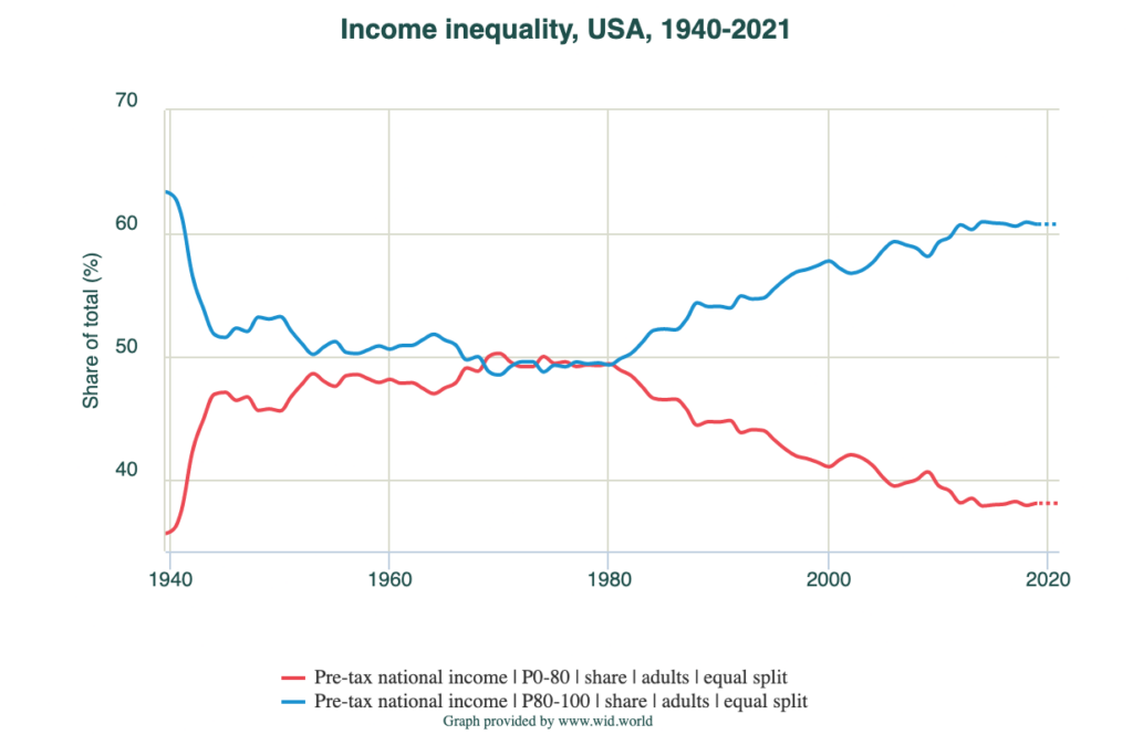
Pay close attention to the 1940-1980s (ish) golden era versus our rust era, which is year 2000 onwards.
Starting with national income of the three groups (Top, Middle, and Bottom, resulting in 100% of population):
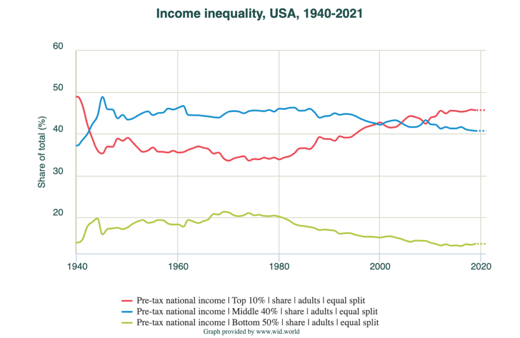
Notice the trend of only one increasing, while the others decrease.
Let’s go in further with the top 20% compared to the bottom 80%:
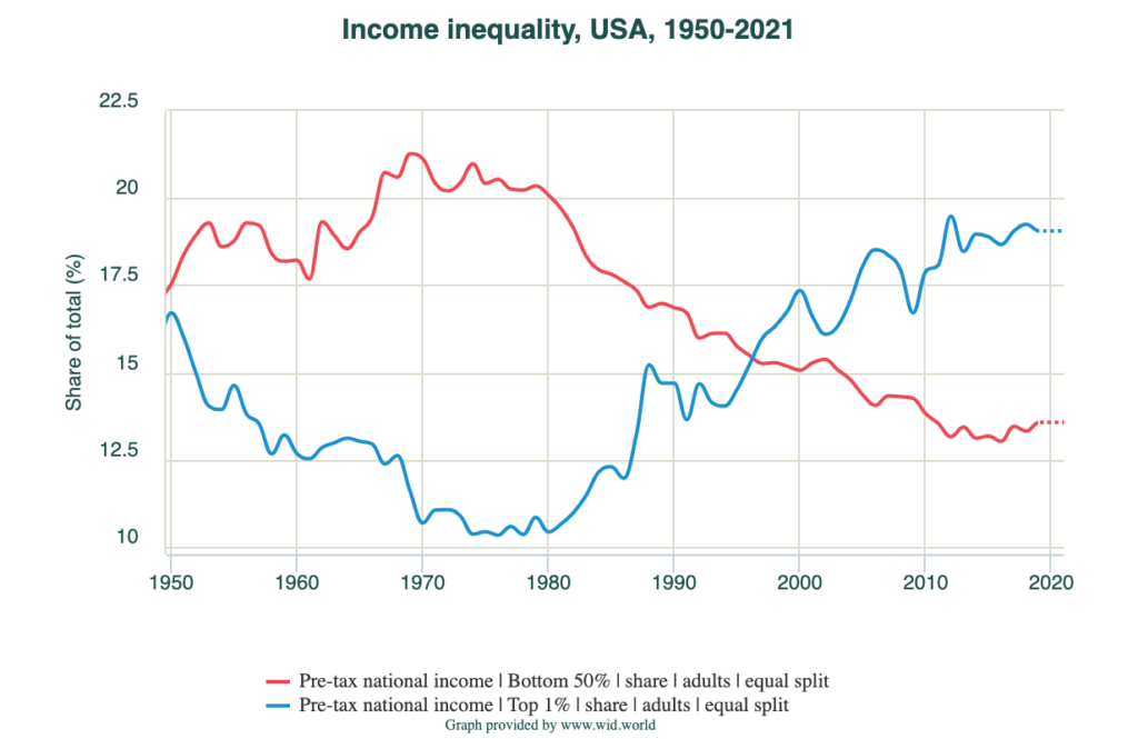
Now let’s finish with income comparing the bottom 50% to the top 1% (also notice the year switch to 1950 instead of 1940 – I messed up the year input.):
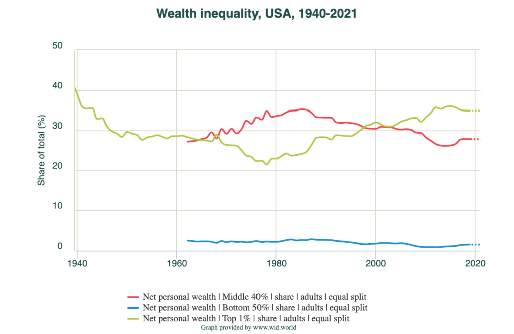
Now let’s compare this with wealth:
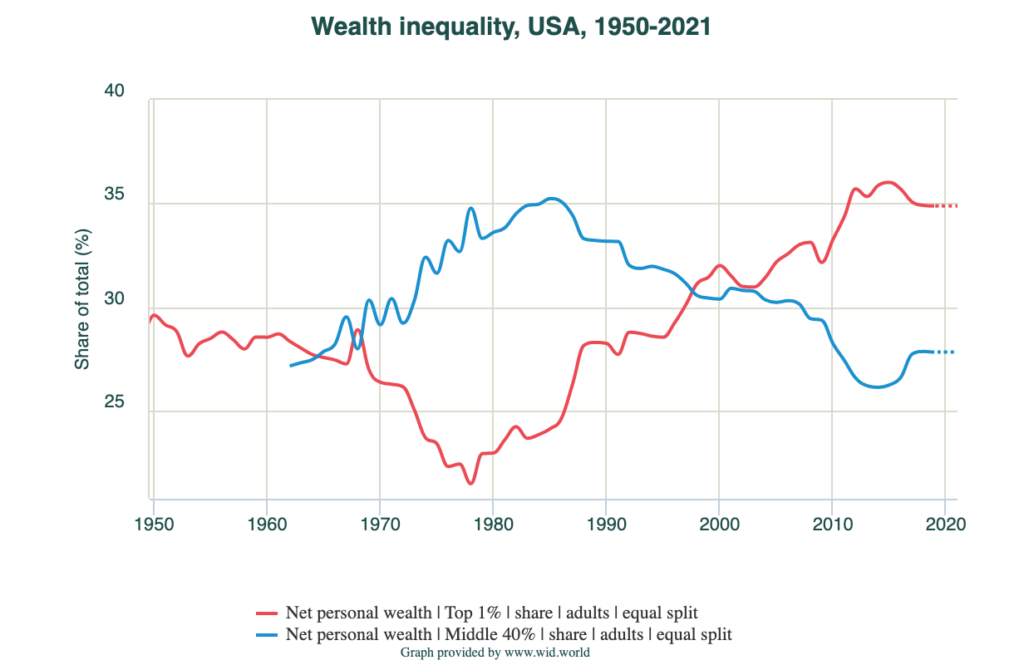
The top 10% also does what you would expect.
One more for good measure (the bottom 50% does not rise above 3% at any point. Still, it has fallen by about half since its height):
If you want to play with these charts, go here.
There was a golden boy period, circa around 1940-1980, when the middle and lower classes were doing far better. This was prime time for the average American. It was the best time that average Americans have ever had financially. That time has fallen, the elites have reclaimed their wealth, and now we’re creeping back to the depression-era inequality metrics.
If you ever wondered why things seem so different from past generations, here is your answer. This is the reason why you cannot do the same things the Boomers and previous generations did and expect a similar result. This is also why many Boomers will never recognize why we aren’t doing better financially and ascribe it to laziness, because they can’t grapple with the ramifications of these charts. They can’t see the golden period they lived in. Some can but many cannot.
There isn’t much more that needs to be said. The graphs speak for themselves.
Read Next:
The Controlled Demolition Of Our Economy
Economic World War: The Severity Of The Dollar Crisis
If you enjoyed this article, bookmark the website and check back often for new content. New articles most weekdays.
You can also keep up with my writing by joining my monthly newsletter.
Help fight the censorship – Share this article!

(Learn More About The Dominion Newsletter Here)